Responsive Testing: Tutorial & Guide
Responsive testing ensures that a website functions seamlessly across different screen sizes and device types, providing a smooth and consistent user experience on desktop, mobile, and tablet. Responsive websites are necessary in an era where users access the internet through various devices. Responsive testing validates that websites perform as expected across different platforms and usage scenarios.
Three key reasons why responsive testing is crucial for modern websites and web apps are:
- Mobile dominance: As per Statista, around 96.2 percent of global users accessed the internet through their mobile phones in the second quarter of 2024
- Enhanced user experience: Responsive design provides consistent and enjoyable interactions across all devices
- SEO benefits: Search engines favor responsive websites, leading to responsive sites ranking higher in search results.
This article provides best practices for responsive testing that can be applied to web-based applications. Readers can expect to learn about tools and techniques to accelerate responsive testing and optimize user experience across platforms.
Summary of key responsive testing best practices
The table below summarizes seven best practices for responsive testing. In the subsequent sections, we explore each best practice in detail.
Identify your target devices and browsers
For a seamless user experience, it’s necessary to identify the target audience and the devices and browsers they use to access the internet. This approach ensures optimal compatibility and saves time and resources by focusing efforts where they matter the most.
- Determine common devices and browsers: Begin by researching the common devices and browsers used by your target audience; this data-driven approach ensures testing aligns with real-world usage patterns. Use tools such as:
- Google Analytics: Check user data to see the types of devices, screen sizes, browsers, and operating systems your audience uses the most.
- Browser Market Share stats: Utilize websites like StatCounter to understand the current browser trend globally or within a specific region.
- User surveys and feedback: Ask users about their preferences and any issues they’ve faced.
- Define support boundaries: Setting clear limits on what browsers and devices to support helps reduce unnecessary complexity. Establish a list of minimum and maximum versions of devices and browsers that need support based on user statistics and business needs. Clear support requirements help allocate more resources to platforms users rely on most.
- Focus on key browsers: Prioritize common browsers such as Google Chrome, Safari, Firefox, and Microsoft Edge to ensure a consistent user experience across all platforms.
- Prioritize popular devices: Depending on the user, statistics cover different versions of commonly used devices like iPhones, androids, iPads, Macs, and Windows PCs for cross-platform compatibility.
- Consider older versions: Include a few older versions of devices and browsers to ensure board compatibility and cater to audiences with outdated devices.
{{banner-large-dark-2="/banners"}}
Prioritize mobile-first responsive testing
With the surge in mobile usage, focusing on mobile platforms first offers several advantages in terms of performance, user satisfaction, and overall engagement.
Follow these steps during mobile-first testing:
- Begin testing by thoroughly evaluating the website's performance on various smartphones and tablet devices. This early focus validates that the core functionality and user experience is smooth on smaller screens.
- Test how well the website responds to touch inputs and verify smooth scrolling, zooming, and navigation. Check all the interactive elements are easy to use with touch, avoiding small or overlapping touch targets.
- Ensure compatibility with mobile-only browsers like Chrome for Android and Safari for iOS.
- Once the mobile functionality is confirmed, move to bigger screens like desktops and laptops.
Why prioritize mobile-first testing?
Key drivers of mobile-first testing include:
- Rise of mobile usage: A substantial amount of internet traffic now originates from mobile devices. With a mobile-first testing approach, you focus on the experience most of your users have.
- Optimized performance: Mobile users often access websites on slower network connections. Testing on mobile devices early on helps identify and address the performance bottlenecks like slow loading time. This approach also encourages developers to optimize content delivery and minimize resources-heavy elements.
- User experience: The mobile-first approach guarantees a seamless and enjoyable user experience on small screens, leading to higher engagement.
Leverage tools for responsive testing
Incorporating the right tool in the responsive testing strategy makes the process more efficient and thorough. Let’s review three types of responsive testing tools teams can use to ensure their website meets performance requirements across browsers and devices.
Browser developer tools

Modern browsers like Chrome, Safari, and Firefox have powerful developer tools for responsive testing. These built-in tools allow us to simulate various environments directly within the browser, making it a great starting point for testing.
Developer tools can be accessed with shortcut key F12 or by right-clicking on a web page and clicking “Inspect”. Here’s how you can leverage key developer tools features
Responsive mode
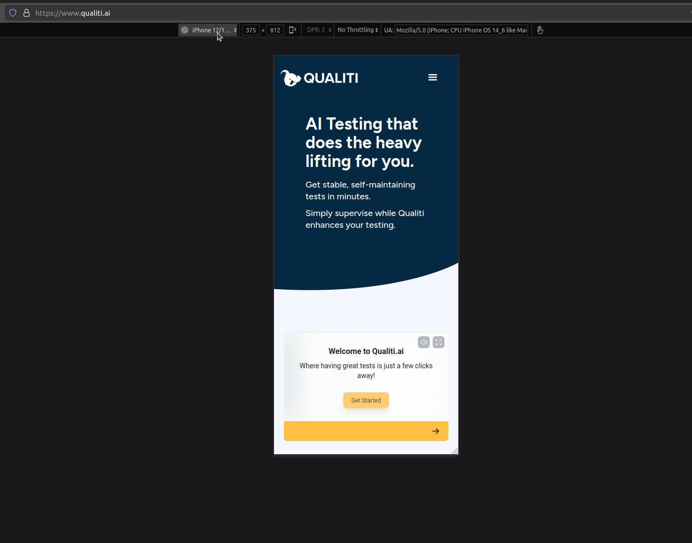
Resize the browser’s window to simulate different screen sizes and check the website's responsiveness. Responsive mode in the browser can be activated as follows:
- Open developer tools (F12 or Inspect).
- Navigate to the "Device Toolbar" icon (a small phone and tablet symbol) in the top left corner of the developer tools panel.
- Select it to activate Responsive Mode.
- Choose from preset screen resolutions (e.g., mobile, tablet, or desktop) or manually adjust the width and height to test custom dimensions.
Device emulation

See how the website appears on popular devices like iPhone, Android, and tablets. To use device emulation, follow the steps below.
- In the Device Toolbar within developer tools, use the dropdown menu to select a specific device model, such as the iPhone 14 Pro Max or Samsung Galaxy S20.
- The viewport will adjust to match the selected device’s screen size and resolution.
- Test features like touch gestures, zoom, and scrolling to mimic actual user interactions.
Network throttling

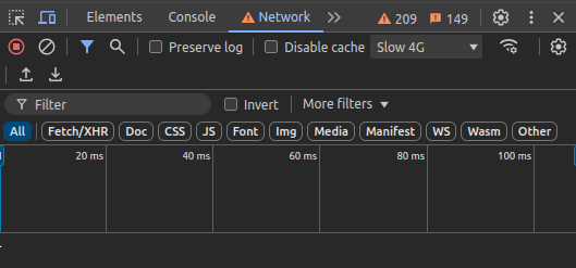
Simulate slower networks like 3G to evaluate the site’s load times and the application's overall performance. To use network throttling:
- In developer tools, go to the "Network" tab.
- Locate the Throttling dropdown menu and choose a preset, such as Slow 3G or Fast 3G, to emulate various network speeds. You can also create a custom network speed as per the requirement.
- Reload the page to observe its behavior under the selected conditions.
Online responsive testing tools
In addition to developer tools, online testing tools make it easy to preview the website’s appearance across various screen sizes and devices without the need for physical devices. These tools quickly check the website for layout or design issues. Two popular online responsive testing tools are:
- Screenfly: This website also allows us to test our site in various device screen sizes. Specifically, it is used to test live production websites taking screenshots of the URL it is given. In addition to basic device simulation, this tool provides extra features such as scrolling, screen rotation, and the ability to test custom screen sizes for board compatibility.
- AmIResponsive: This simple responsiveness checker helps us quickly visualize the site’s appearance across multiple viewports in a single snapshot. One limitation of this app is the devices are limited and it only supports Apple products. However, it’s a handy tool for swiftly checking the website's layout across multiple Apple devices.
AI tools for responsive testing

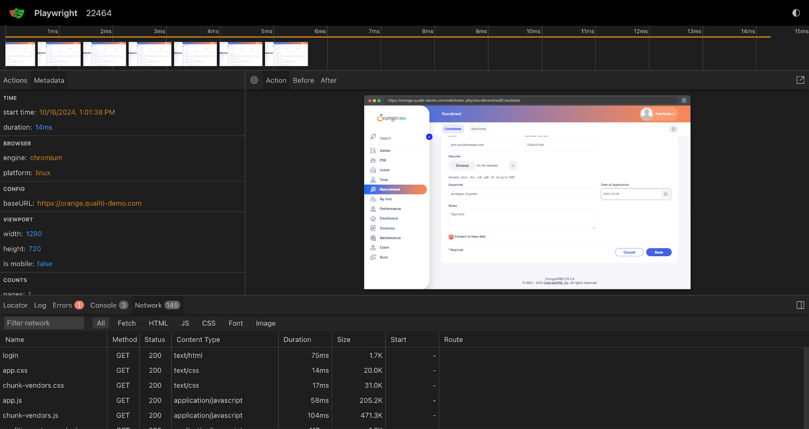
AI-powered tools like Qualiti offers a seamless way to automate critical user journeys using natural language or code, making test creation intuitive and efficient. By leveraging Playwright as its underlying test automation, Qualiti combines both the power of Playwright and the intelligence of AI to facilitate cross-browser testing. Tests can be configured per test or at the project level. This enables the visual regression testing of sites in many viewports, ensuring the website's design remains consistent across different screen sizes. During later iterations of the codebase, screenshots of new visual issues will be usable. This can be incorporated into continuously deployed apps to prevent unintended changes.
{{banner-small-3="/banners"}}
Test different screen sizes and orientations
With users accessing websites on devices ranging from mobile to desktop, we must confirm that all the elements in the page adjust as per the screen size. Here are some of the ways to do that:
- Verify the elements like images, text, and navigation adapt seamlessly: Test that the images resize appropriately or switch to a smaller resolution to avoid stretching and remain clear while using devices of variable sizes. Confirm text readability in portrait and landscape orientation. Ensure the navigation menu transfers into a collapsible version (e.g., a dropdown or hamburger menu) while shifting towards the small screens. Check the page navigation is smooth.
- Confirm fonts are easily readable on different screens: Validate the fonts are large enough on small screens and don’t require zooming. On a large screen, fonts shouldn’t be too small. Consider line height and letter spacing for general readability and the website’s aesthetics.
- Validate performance in portrait and landscape mode: Evaluate how the content rearranges itself when users rotate devices, and ensure that no part of the website breaks or becomes unusable. Test touch interactions, navigation, and media rendering in a vertical and horizontal orientation for an optimized user experience.
Test on real devices
While emulators and simulators are powerful tools for testing the website’s responsiveness, they cannot fully replicate the complexities of real physical devices. Testing on actual devices certifies the website performs well in real-world scenarios.
Why does testing on real devices matter?
Device emulation is useful, but it isn’t foolproof. Here are five use cases where running responsive testing against real devices is important:
- Detect hardware-specific issues: Emulators/simulators often fail to capture nuances like hardware limitations, OS-level behaviors, or minor browser inconsistencies that can arise in a physical device.
- Account for real-world behavior: Features like touch interaction, scrolling, animations, and zooming can behave differently on real devices compared to emulators/simulators.
- Provide perspective on real-time usage: Testing on real devices gives perspective on how the user might interact with the application in real-time, which provides insights into usability issues or areas of improvement.
- Capture data on resource utilization: A real device provides an accurate measure of load times, CPU usage, and battery consumption, which helps optimize the website's performance.
- End-to-end test with required hardware: Applications that use specific device hardware, like a camera or microphone, require a real device to evaluate their functionality. Emulators might not be able to replicate actual behavior fully.
While testing on a real device, it’s essential to use a mix of popular devices like phones and tablets to maintain compatibility. If physical devices aren’t accessible, consider using cloud testing platforms that offer remote access to real devices for testing.
Automation testing
Going through various browsers and testing in different resolutions can be a tedious process, and this is where modern test automation frameworks like Playwright can help. These frameworks allow teams to test their applications in major browser engines like Chromium, Webkit, and Safari. This can be vital to verify cross-browser compatibility. Additionally, they allow QA engineers to change the browser viewport to test a website with different screen sizes.
Here’s a quick example of how we can setup Playwright for cross-browser testing in different screen sizes and browsers:
// playwright.config.js
import { defineConfig, devices } from "@playwright/test"

export default defineConfig({
	projects: [
		{
			name: "chromium",
			use: { ...devices["Desktop Chrome"] },
			viewport: { width: 1280, height: 720 },
		},

		{
			name: "firefox",
			use: { ...devices["Desktop Firefox"] },
		},

		{
			name: "webkit",
			use: { ...devices["Desktop Safari"] },
		},

		/* Test against mobile viewports. */
		{
			name: "Mobile Chrome",
			use: { ...devices["Pixel 5"] },
		},
		{
			name: "Mobile Safari",
			use: { ...devices["iPhone 12"] },
		},

		/* Test against branded browsers. */
		{
			name: "Microsoft Edge",
			use: { ...devices["Desktop Edge"], channel: "msedge" },
		},
		{
			name: "Google Chrome",
			use: { ...devices["Desktop Chrome"], channel: "chrome" },
		},
	],
})
The above configuration file defines the list of devices, browsers, and viewports for testing our application.
In the snippet below, we write a simple test to check the home page layout by asserting the visibility and content of specific elements, such as heading and footers. Playwright automatically executes this test in parallel across all the devices and browsers specified in the configuration, providing robust test coverage in less time.
// tests/example.spec.js
import { test, expect } from "@playwright/test"

test.use({
	viewport: { width: 1600, height: 1200 },
})

test("Verify homepage layout", async ({ page }) => {
	await page.goto("https://www.qualiti.ai/")
	// Check heading visibility
	await expect(page.locator(".heading-11")).toBeVisible()
	// Check the heading text
	await expect(page.locator(".heading-11")).toHaveText(
		"AI Testing that does the heavy lifting for you."
	)
	// Check footer visibility
	await expect(page.locator(".footer")).toBeVisible()
})
Some of the things to take into consideration while automating regression tests:
- Prioritize core functionalities: Focus automation efforts on critical user journeys and core functionalities to validate the important features work perfectly across devices. This approach also accelerates the feedback loop in case anything breaks due to regression.
- Visual regression testing: Automatically comparing screenshots and snapshots of websites within different viewports is an efficient and reliable way of identifying visual regressions, like layout shifts, broken elements, or unexpected style changes.
- Automate repetitive workflows: Automate workflows that are repetitive and don’t require extensive human judgment. This helps concentrate effort on areas that need human effort. For instance, cross-browser compatibility tests can be automated to save time and effort.
- CI/CD integration: Integrate the automated tests in a continuous integration environment so that tests are run automatically whenever code is updated, providing rapid feedback and resolution of regression.
Monitor performance and load times
Performance and load times are vital for user retention and engagement, so it’s crucial to monitor these aspects to confirm our site remains fast, efficient, and user-friendly. Performance and load times can be validated with the following approach:
- Test on different network speeds: Simulating slow network conditions helps evaluate our site performance in real-time scenarios. Many users may access the site on slower networks, making it essential that the site remains accessible during such events. Browser developer tools can be used to throttle the network speed.
- Check resource loading: Heavy resources like images, videos, and scripts can significantly impact site performance, especially on mobile devices. Images and videos should be compressed(perhaps using formats like WebP or WebM) and sized properly for the web. Lazy loading of the images is another approach that improves the load times. Similarly, CSS and JavaScript files can be minified and loaded asynchronously for better performance.
- Evaluate speed across devices: Performance can vary between high-end and low-end devices due to differences in processing power and memory. Test the website on both high-end and low-end devices, paying close attention to how the website performs on low-end devices with limited resources. Identify and resolve any performance bottlenecks that might impact the user.
{{banner-small-4="/banners"}}
Last thoughts
With most internet traffic originating from mobile devices, a responsive website is crucial for a seamless user experience and maximizing engagement. By leveraging tools like emulators, simulators, and real devices coupled with cloud-based platforms, we can thoroughly test the responsiveness of our application.
Automating workflows removes the tedium of manual testing, saving time and effort by accelerating the regression feedback loop and increasing testing efficiency. Additionally, monitoring performance and load times across diverse devices is essential for user engagement and satisfaction. Responsive testing is a crucial part of modern web development. Combining manual and automation testing approaches can help deliver a consistent user experience across all devices and platforms.


